Interesting question.
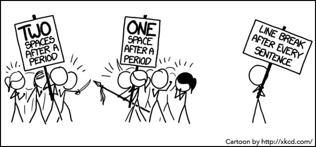
I was taught to leave two spaces after a full stop, but that was in the days of manual typewriters (ooops - showing my age there!).
Typewriter characters had a monospaced type, which means every character occupied an equal amount of horizontal space, giving you text that looked gappy with a lot of white space between characters and words. If you think of the difference in size between a lower case i or number 1 to a capital M or W you can see what I mean. It was harder to spot the spaces between sentences, so it was more usual to leave two (sometimes even three or four!) spaces after a full stop to make the end of sentences clearer.
When electric typewriters and computers came into being in the 1970s the characters used proportional fonts, which means the typeface contained characters of varying widths (Courier being the one major exception). These are easier to read and look more professional.
Because we now all use these modern fonts there is no need to leave two spaces after a full stop as it no longer enhances readability. This standard was adopted because editors, typographers, writers and others settled on it after years of experience.
Hard habit to break though ...